I’ve started noticing a trend in the logos of many online tea vendors. They are looking a lot alike, more so than usual. Design tends to go this way. Some of you might remember the 70s styles and color palettes (things like avocado, harvest gold, and chocolate brown). Then there was the 80s, the 90s, and so on. I found 6 that featured teacups, steam, and possibly a tea leaf that were pretty much in the same style and with similar colors.
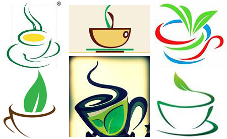
They’re all great. They all say “tea” loud and clear. And they have the essentials stripped down to their simplest form. In one of my design classes years ago, we called this “essentialism” – using a minimum of visual information to convey the image of an object. You can clearly see that teacup. The steam is also quite recognizable. The tea leaves are fairly obvious, especially to anyone familiar with where tea comes from. Several look like they were done by the same design.
The vintage designs had a lot more detail, like this one:
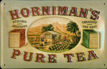
The additional detail doesn’t necessarily tell you more about the product, but it does convey a very different feeling. While the more essentialist (or minimalist) ones above say “tea,” the older one conveys a whole feeling of warmth and comfort. Both are fine but different – yesterday with its simpler lifestyle but more detailed imagery and today with a lifestyle crowded with movie downloads, social media, video games, sports events, and tons more, that cries out for a bit of simplistic design. Gee, sort of a yin-yang thing.
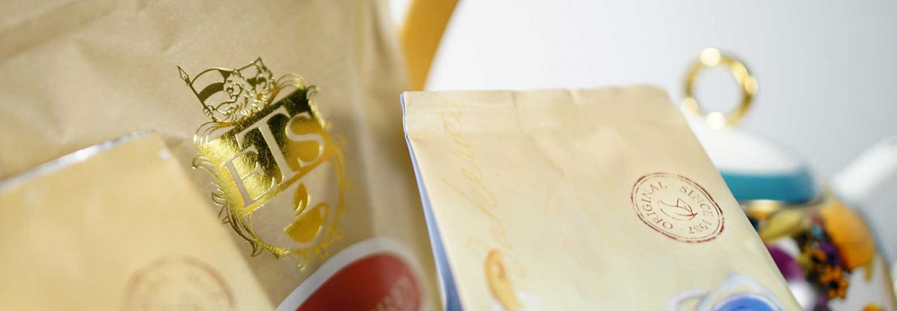
Of course, The English Tea Store, owner of this blog, has a more complicated logo that includes a reference to something fairly but not exclusively British: a coat of arms and a shield. And there’s a teapot on the shield. They leave the rest up to you.
By now you’re wondering where this is all leading. Well, no where, actually. The designer in me just wanted to point out the similar designs I was seeing and share the joy!
See more of A.C. Cargill’s articles here.
© Online Stores, Inc., and The English Tea Store Blog, 2009-2014. Unauthorized use and/or duplication of this material without express and written permission from this article’s author and/or the blog’s owner is strictly prohibited. Excerpts and links may be used, provided that full and clear credit is given to Online Stores, Inc., and The English Tea Store Blog with appropriate and specific direction to the original content.

Leave a comment